Hello there everyone!
Sorry for the lack of posts here. I admit, I'm pretty sold to tumblr now! I really like the networking concept with it, with the likes, reblogs and such. For wip's you can follow me there now! I think it will be difficult for me to keep up with two blogs, and a good chunk of my friends are already on there to begin with.
http://artofsekhmet.tumblr.com/
Tuesday 8 May 2012
Wednesday 15 February 2012
Sareena's Quest


Few progress pics of this recently completed commission.
Sorry for the lack of updates, I've been horribly busy lately :C
Wednesday 30 November 2011
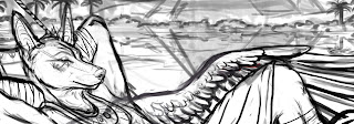
Process of "Basking in Egypt's Gold"
WARNING: Long Post is Long! D:
Hello everyone! A bit late this week with the blog update, but with reason. I was painting in turbo-mode to get this commission done. I took the time to photograph my progress frequently, since I hear people really love seeing an artist's process (and I for one, like seeing the process of others a lot myself). Feel free to ask questions. Chances are I'll forget to mention something. Anyhow, this is how I work, and is certainly not the only way. I just figured I'd share. This piece had a lot of VERY NEW things for me, that I never painted before so it was challenging. I learned a lot, and had fun :3

First thing's first!
Supplies:
For this painting I used 140LB Arches Satin Finish Watercolor Paper.
Kraft Watercolor Tape.
Holbein Watercolors.
Winsor Newton Ox Gall Liquid.
Winsor Newton Colored Masking Fluid.
Winsor Newton Designers Gouache (BleedProof White).
Faber-Castell Polychromos colored Pencils.
A Bit About Supplies: (Feel free to move on if you already know this!)
I choose a hot press watercolor paper because it is not too textured. Not that texture is bad, but my technique is watercolor as a base, colored pencil on top to bring everything out. So if my paper was too textured, the image would look really grainy (personal preference,really. If you like grain go for it- but it sticks out like a sore thumb when scanned). 140 lb is great, because it can still take enough abuse(many layers of pigment), but at the same time you can still easily see through it when transfering your sketch with a light box. I transfer with polychromos faber-castell colored pencils, because they stay put when laying down washes.
The paper has been pre-stretched on a masonite board with kraft tape. This prevents buckling of the paper and keeps it flat. Its important to add some water to the masonite board with a sponge, and completely wet your paper (under cold water). Make sure your masonite board and sponge are clean, because you don't want any ugly acidy spots appearing on your paper later on. Be sure to not soak the kraft tape, orelse it wont stick. Gently dab with a sponge. You have to wait until it is bone dry before continuing.
Sketch:

Approved sketch. The final product is indeed traditional, I just sometimes like sketching digitally to save time. Makes fixes for clients much more simple and fast too.

This is my main set up. I've got references for palm trees, and water here. Started the washes on the sky. Added a bit of oxgall fluid to my water to help the wash flow. The trick for the clouds is to twist up a piece of paper towel and press it against the paper before the wash dries. You will also notice I have my original sketch close by. As we add shading (especially on a dark colored character), there is a chance we will lose the main lines of the transfer: so the sketch is kept nearby as a reference.
 The general idea is to start blocking in the shadows, so I use a payne's gray to indicate where I want them. Then I add the final color ontop. Example: the palm tree was initially shaded in payne's gray. Then I added ochre's and brown pigments ontop. I like doing it first as often as I can remember to, because it maps out how I shade the color ontop.

Same process. shading and adding color. I also get into more detail with the background. I always hear were "supposed" to start with the background first in illustrations. In this case, I'm alternating between background and foreground while waiting for certain parts to dry. I think it really depends on the piece and the medium.
 Background complete, and time to add shade to the character. I did a quick approximate mock up of how I wanted the shading. Doing tree leaf shading was new to me.

More washes of color on the character and background. I discovered that the more pigment/work you do on the watercolor piece, the less grainy and the bolder it will look as an end result(with the colored pencils). The bottom pannel shows me starting to add colored pencil on that wing. I use a piece of paper to shield my hand as I work(orelse it will smudge, and you dont want your hand grease on your drawing).

I continue rendering in colored pencil. You may have noticed here that I do not go over the background in colored pencil. This is in order to help create more depth, since the background is less crisp. It will push it back by leaving it. I smoothen out the shading under the hammock by using ochre and naple colors. I go back to the date palm tree leaves to sharpen them a bit more.

Last but not least, I add highlights with designer's gouache (for the jewelry and water). I also have some very nifty iridescent gold watercolor paint. I added a thin film ontop of the jewelry and spear, so it has a golden sheen to it in real life.
 Scanned, levels fixed, and were done :)
Thanks for reading my long post :P
I hope you enjoyed
-Sekhmet
Hello everyone! A bit late this week with the blog update, but with reason. I was painting in turbo-mode to get this commission done. I took the time to photograph my progress frequently, since I hear people really love seeing an artist's process (and I for one, like seeing the process of others a lot myself). Feel free to ask questions. Chances are I'll forget to mention something. Anyhow, this is how I work, and is certainly not the only way. I just figured I'd share. This piece had a lot of VERY NEW things for me, that I never painted before so it was challenging. I learned a lot, and had fun :3

First thing's first!
Supplies:
For this painting I used 140LB Arches Satin Finish Watercolor Paper.
Kraft Watercolor Tape.
Holbein Watercolors.
Winsor Newton Ox Gall Liquid.
Winsor Newton Colored Masking Fluid.
Winsor Newton Designers Gouache (BleedProof White).
Faber-Castell Polychromos colored Pencils.
A Bit About Supplies: (Feel free to move on if you already know this!)
I choose a hot press watercolor paper because it is not too textured. Not that texture is bad, but my technique is watercolor as a base, colored pencil on top to bring everything out. So if my paper was too textured, the image would look really grainy (personal preference,really. If you like grain go for it- but it sticks out like a sore thumb when scanned). 140 lb is great, because it can still take enough abuse(many layers of pigment), but at the same time you can still easily see through it when transfering your sketch with a light box. I transfer with polychromos faber-castell colored pencils, because they stay put when laying down washes.
The paper has been pre-stretched on a masonite board with kraft tape. This prevents buckling of the paper and keeps it flat. Its important to add some water to the masonite board with a sponge, and completely wet your paper (under cold water). Make sure your masonite board and sponge are clean, because you don't want any ugly acidy spots appearing on your paper later on. Be sure to not soak the kraft tape, orelse it wont stick. Gently dab with a sponge. You have to wait until it is bone dry before continuing.
Sketch:

Approved sketch. The final product is indeed traditional, I just sometimes like sketching digitally to save time. Makes fixes for clients much more simple and fast too.


Same process. shading and adding color. I also get into more detail with the background. I always hear were "supposed" to start with the background first in illustrations. In this case, I'm alternating between background and foreground while waiting for certain parts to dry. I think it really depends on the piece and the medium.


More washes of color on the character and background. I discovered that the more pigment/work you do on the watercolor piece, the less grainy and the bolder it will look as an end result(with the colored pencils). The bottom pannel shows me starting to add colored pencil on that wing. I use a piece of paper to shield my hand as I work(orelse it will smudge, and you dont want your hand grease on your drawing).

I continue rendering in colored pencil. You may have noticed here that I do not go over the background in colored pencil. This is in order to help create more depth, since the background is less crisp. It will push it back by leaving it. I smoothen out the shading under the hammock by using ochre and naple colors. I go back to the date palm tree leaves to sharpen them a bit more.

Last but not least, I add highlights with designer's gouache (for the jewelry and water). I also have some very nifty iridescent gold watercolor paint. I added a thin film ontop of the jewelry and spear, so it has a golden sheen to it in real life.

Thanks for reading my long post :P
I hope you enjoyed
-Sekhmet
Monday 21 November 2011
Sneak Peak
Here is a crop of the sketch for Duamutef's commission. It is currently being rendered, and should be finished soon. I am documenting my progress as I go so I will be making a larger post with all combined elements when I'm done :)
 Thank you for looking!
-Sekhmet

-Sekhmet
Monday 14 November 2011
Testing Watercolor Mediums
A quick doodle of a snowy owl on a scrap piece of 140 lb Arches Satin finish paper I had. Based off of Francois Boucher's photographs (with permission) on flicker - purely for practice. I don't quite have "the eye" for avians yet, even if I used reference, so feel free to redline :) I did have trouble with that wing that is on an angle.
In order to make the clouds here, I lifted the wash with a wet paper towl that was twisted up. You need to have your paper still wet with color in order to achieve this.

I used Holbein watercolor paints. Not many colors, just cerulean blue, ultramarine, paynes gray, permanent violet and a teeny bit of cadmium yellow.
I decided to test a few of the mediums I recently bought: Gum Arabic and Oxgall Liquid. I also have blending medium, but this takes wayyy too long to dry and I was rather impatient.
Gum Arabic tends to saturate color really nicely. Allows for some nice washes, and easy blending of color. If there is too much applied and used alone, it tends to leave a bit of a semi-gloss finish. It needs to be completely bone dry (and no longer sticky) before you can apply any other dry media on top, orelse it doesnt want to adhere to the paper. Gum arabic can also be added to acrylics and inks--it is not exclusively for watercolor.
Oxgall Liquid is awesome because it simply helps you make seamless washes. Improves overall flow of washes when added to water :) --Dries just like water onto the paper. Application of dry media on top (such as the colored pencil on top of watercolor technique) afterwards poses no problem.
Both mediums work fine on hotpress or coldpress papers. I found that gum arabic was less obvious on my satin finish arches paper, compared to when I tested it on illustration board.
I came across an excellent book at work recently, called "The Complete Watercolorist's Essential Notebook: A treasury of watercolor secrets discovered through decades of painting and experimentation".
It is a breath taking book: beautifully organized layout, cute illustrations along with explanations, stunning examples, and cram-packed with tips on how to paint better with watercolors.
Another book I've enjoyed over the years was "Everything You Ever Wanted to Know About Watercolor" . Really worth the purchase if you want to continue to explore with this medium.
Thank you for reading :)
Totally unrelated, but I will have auctions up on furbuy very soon!
Sekhmet
Monday 7 November 2011
Netherfaris Commission Process
Hello everyone!
I had meant to post an update yesterday, but it was a horribly busy day. The following is my process for Anbessa's other commission, of his Jackal character Netherfaris. The process is very similar to my last update, so I will not post elaborate explanations. Feel free to comment if you have any questions though :))
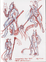
Here are some tiny scribblies for the pose. At first I liked the leaping pose, but realized I had a work in progress that is very similar to that pose. I asked around and the bottom left one got the best positive feedback.


The commissioner wishes to have some final color added, so I'll be rendering this guy completely soon :)
Thank you for looking,
Sekhmet
I had meant to post an update yesterday, but it was a horribly busy day. The following is my process for Anbessa's other commission, of his Jackal character Netherfaris. The process is very similar to my last update, so I will not post elaborate explanations. Feel free to comment if you have any questions though :))
Here are some tiny scribblies for the pose. At first I liked the leaping pose, but realized I had a work in progress that is very similar to that pose. I asked around and the bottom left one got the best positive feedback.
Next, I do a sketch based on the selected doodle. Take note, even if there is clothing present on the character that will hide the underlaying anatomy--I draw the entire body anyways to help give it it's appropriate shape.

Now I clean up the sketch and give some detail:

At this time, I wanted to experiment a bit with digital textures. So I play with textures, light and shade and get this result:

The commissioner wishes to have some final color added, so I'll be rendering this guy completely soon :)
Thank you for looking,
Sekhmet
Sunday 30 October 2011
Hamamelis & Kornblume Commission Process
Decided to find the bits and pieces of my process for another image.
This was a commission I did for Anbessa of his two characters, Hamamelis and Kornblume.
I started off with a series of tiny (ugly XD) drawings of my ideas for the poses and composition:


I decide to go with the doodle on the top left in the first drawing. Next, I scan it and load it into photoshop. I like sketching in photoshop now, since it saves me a lot of time (and paper & printer ink (no need to print references this way)). On top of the doodle, I start sketching my final lines:

This is what the sketch looked like more cleaned up. The composition was readjusted, as were the poses. Put everything more on a diagonal to make it more dynamic than what was roughed out above.

I transfered the sketch onto paper and started shading it with a variety of graphite pencils.I felt the image needed an old story feel, so it would greatly benefit from visible pencil strokes.

Next, I decide to add a bit of colour since that tends to catch the eye more. For that "old" feel, I decide to add a yellowish sepia texture to the background to enhance that. This was a texture I made awhile back with watercolour, tea, salt, and alcohol:

But now it appears flat again. So it was time to reintroduce some light. I'm a fan of Royo's fantasy art, so pardon my god rays and mega sword shine X3

Levels are adjusted and now I consider it complete! :)
A rather simple process. Thank you for looking.
A rather simple process. Thank you for looking.
Subscribe to:
Posts (Atom)